VMag
Publication and Layout Design
Adobe InDesign, Adobe Photoshop
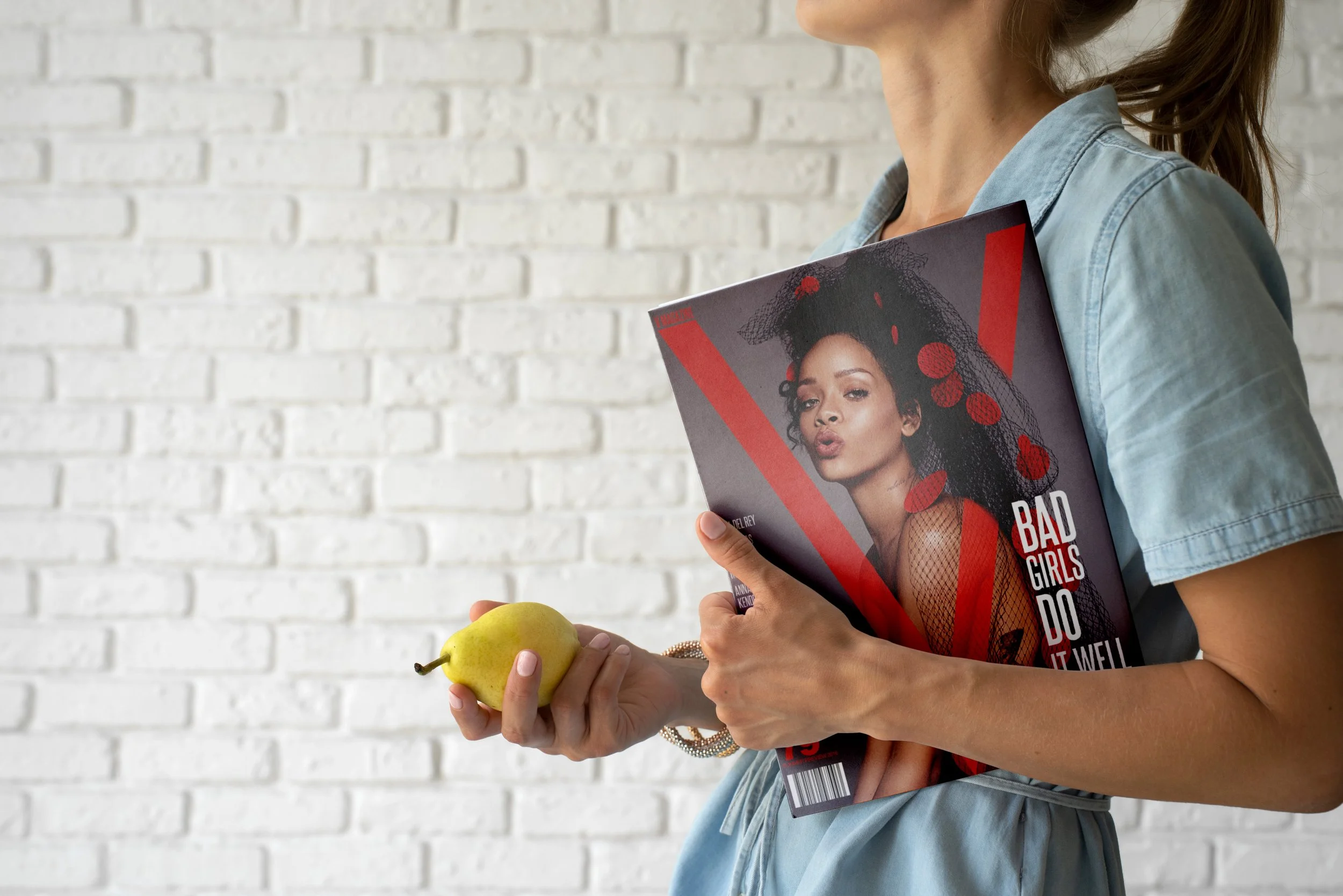
The goal of the project was to showcase effective layout designs, strong typography arrangement, formatting and utilization of a grid system. The V Magazine Cover Design was created as a final project for a publication class at my previous school, IRSC. The project includes one cover design and four full-page spreads that compliment the theme of the cover. The concept behind the layouts stems from wanting to showcase bold, yet minimal designs that function with unity, consistency and cohesiveness. The intended audience for the VMag cover design is females in their early 20’s to early 30’s who are into the latest trends and fashion. The audience also prefers things that are classy, elegant and simple, which are represented in the cover design and spreads. In order to create an effective overall design, the cover and spread layouts needed to showcase effective use of visual and informational hierarchy, balance, utilization of a grid system and strong arrangement and composition techniques.
Thought Process & Concept Sketches
For the project, we had to adhere to the VMag brand standards by using the “V” across the cover as well use of the typeface used for the brand, Steelfish. The class was given freedom in selecting imagery and typography that was representative of the VMag brand. This translated into four visually appealing and professional looking spreads that showcase a range of my skills as a designer.


Color Palette & Typography
Selecting and editing the photos I chose for the cover, then ideating on how the photos would compliment the layouts I had sketched and imagined was a key challenge during this project. Figuring out how to arrange the imagery and typography on each spread as well as the cover was an exercise that required me to sketch various layouts, experiment with different fonts and format the typographic elements found on the designs.
Outcome
My aim was to create simple layouts that were visually striking which showcase effective use of hierarchy and balance within the compositions. The message communicated through this artifact is simplistic elegance, fearlessness and boldness. This is shown within the layouts and cover with the simple, yet eye catching visuals that pair with the typographic layout and formatting which are presented in a professional and polished way. I utilized a grid system as well as principles of design such as balance, hierarchy, space, alignment and movement to create vivid cover and eye catching spreads that communicate V Magazine’s message purposefully and effectively.