BeatsFest
Brand Identity Creation
Adobe Illustrator, Adobe Photoshop, Adobe InDesign
BeatsFest is a brand identity assignment created for a Brand Identity course at Southern New Hampshire University for the course final project. The objective was to create a cohesive brand identity that consisted of a logo, color palette and typography system. The brand identity project also required a complete brand style guide for one of three companies outlined in the mock design brief given to students for the project. The BeatsFest brand is a cloud based music platform experience that aims to connects young, diverse listeners with the latest tracks and artists from around the globe.
Thought Process & Concept Sketches
After reviewing the design brief that outlined the preferences for the BeatsFest brand, understanding the BeatsFest target audience and competitors, I began defining the goals for the identity. I wanted the logo to embody a musical element, since it is a music streaming service. I incorporated an equalizer meter into the F of the logo to give it a unique and visually appealing component. I went over various iterations of the design, sketching the letters B and F in musical notes and different shapes until I arrived at the first stages of the design that I found best represented the BeatsFest brand.

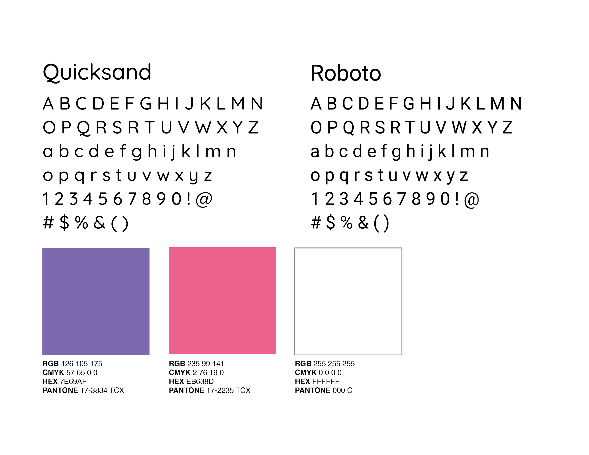
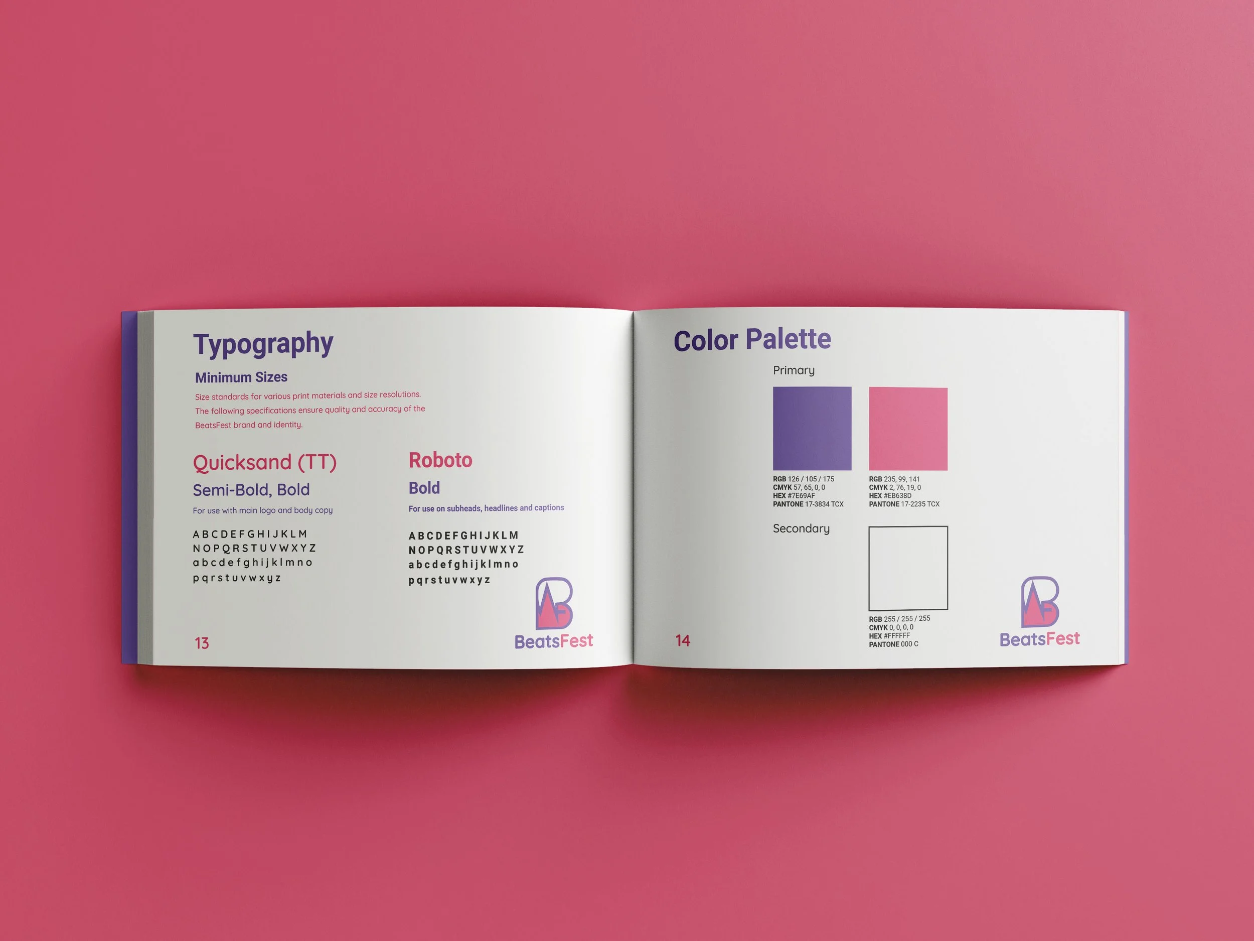
Color Palette & Typography
Selecting the typefaces that best fit the BeatsFest identity I envisioned in my mind was a challenge I encountered during the creation of this project. I wanted the typeface for the name BeatsFest to be modern and fresh and not any generic sans serif typeface. The design brief called for typographic choices that were simple, readable and legible that suited a younger audience and I found that the main typeface choice, Quicksand, fit the BeatsFest technology based, music streaming service identity very well. The color palette was chosen by referencing the design brief with preferences of vibrant colors and analyzing BeatsFest’s competitors (Spotify, Apple Music) to stand out on its own as a unique and effective design.
Outcome
After refining the final logo by experimenting with different color variations, formatting, such as kerning between the brands name and editing the anchor points on the logo, the idea of BeatsFest came to life. The project concluded with a complete brand style guide that outlines the mission of BeatsFest, the rules of logo usage and all other key components of a brand style guide such as color palette rules, typography rules and how to present the logo.