The Pestilence
Publication and Typography Design
Adobe InDesign, Adobe Illustrator
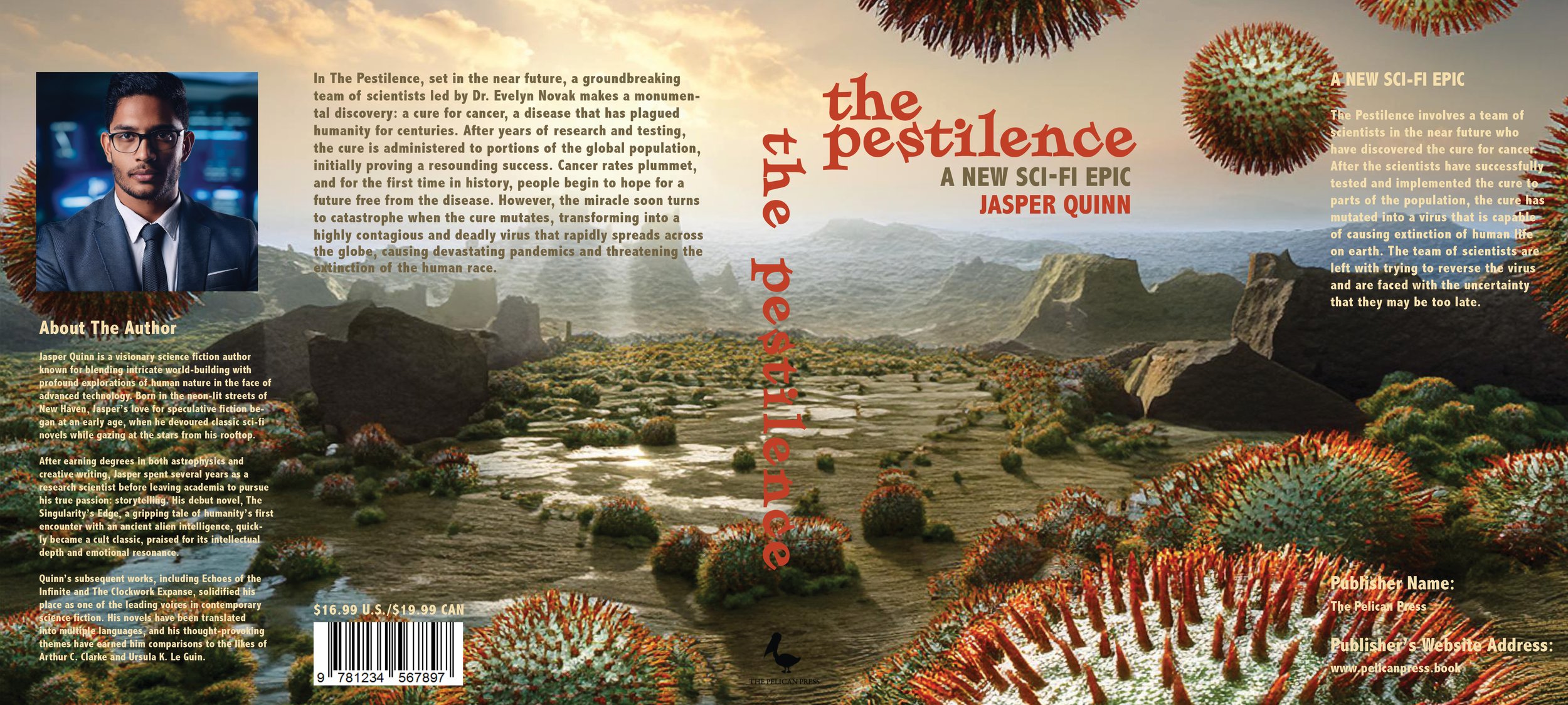
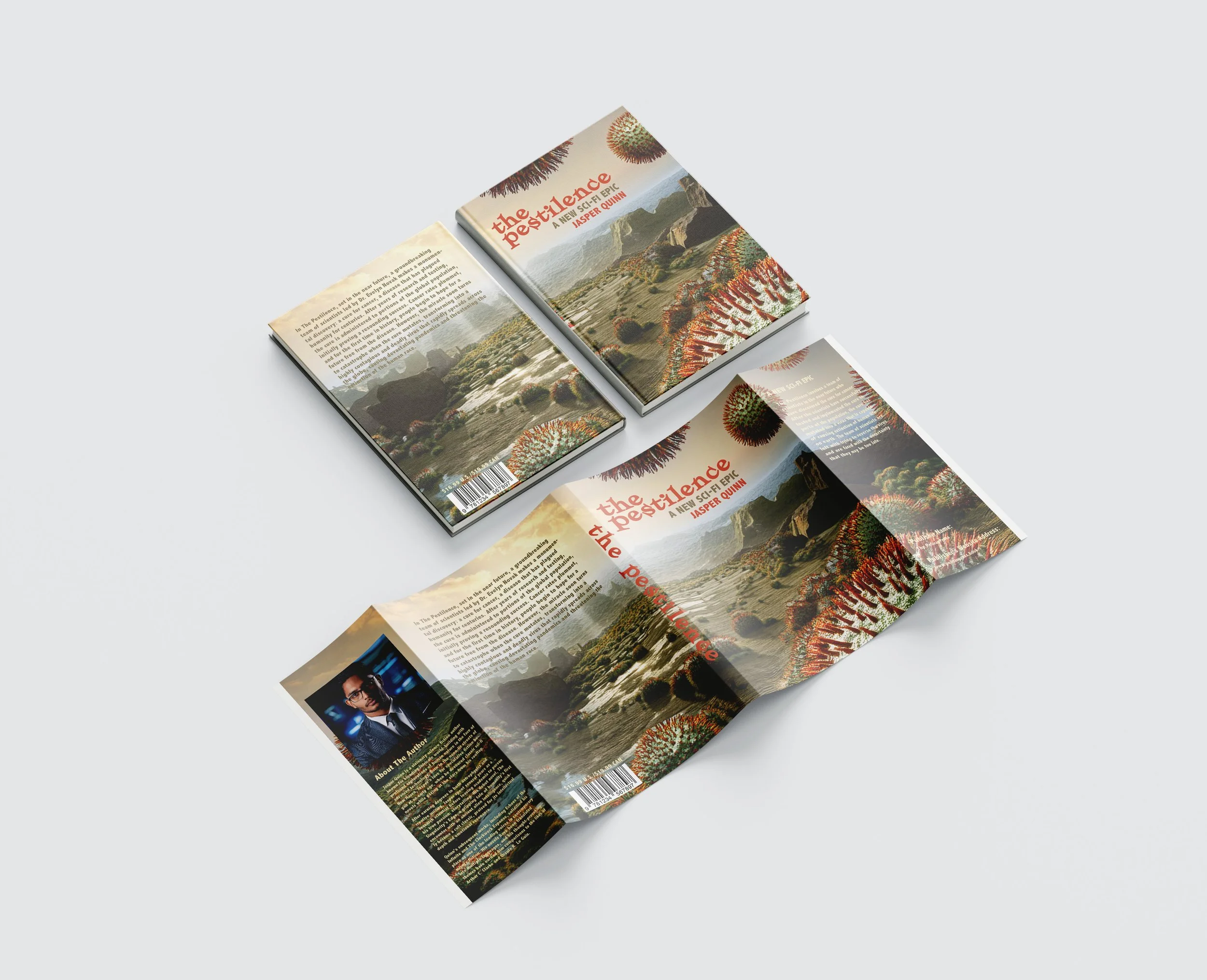
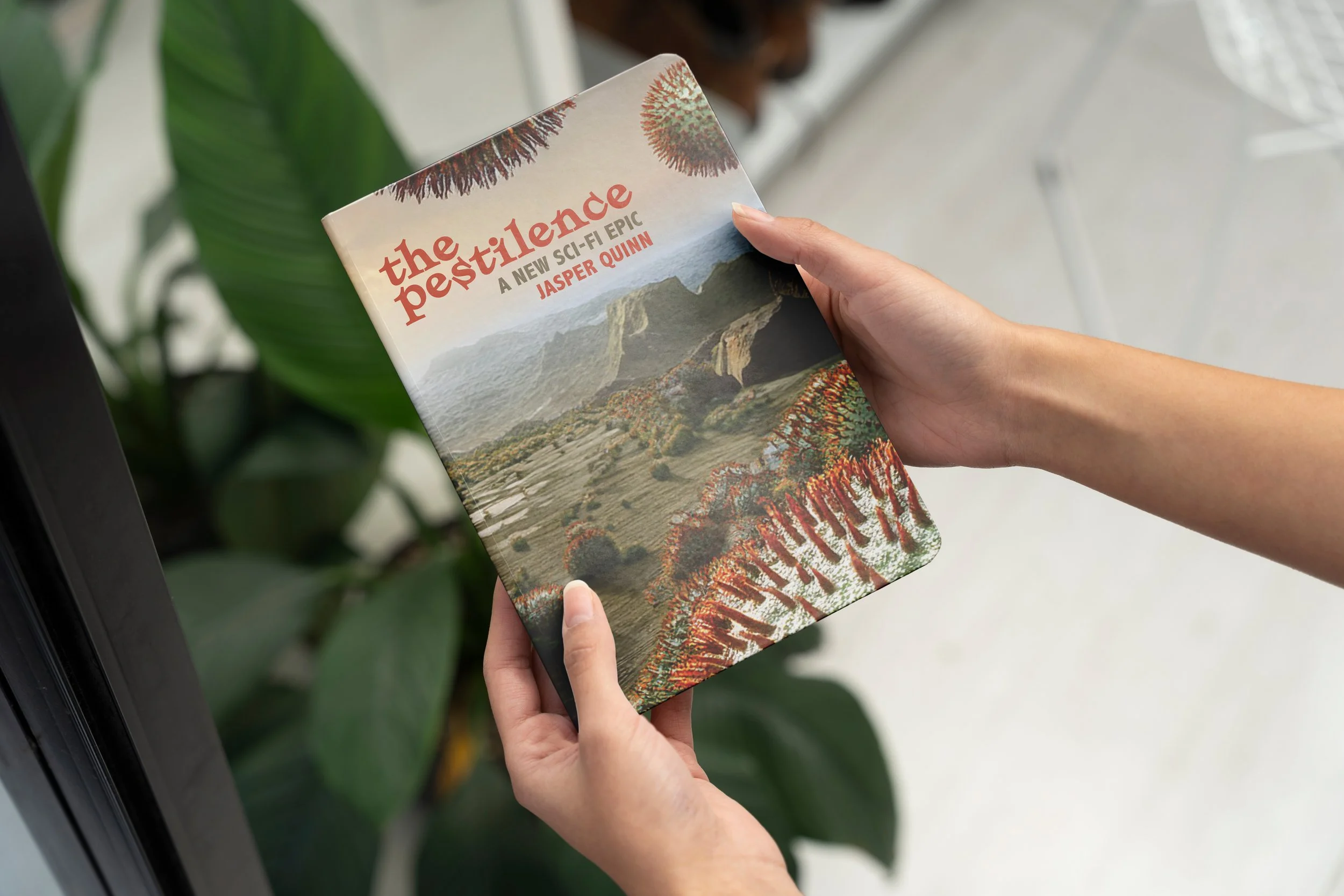
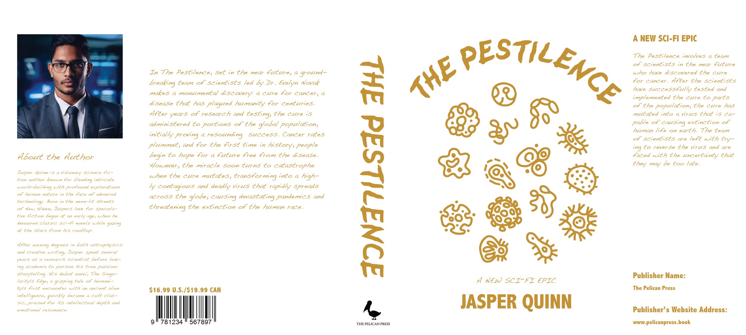
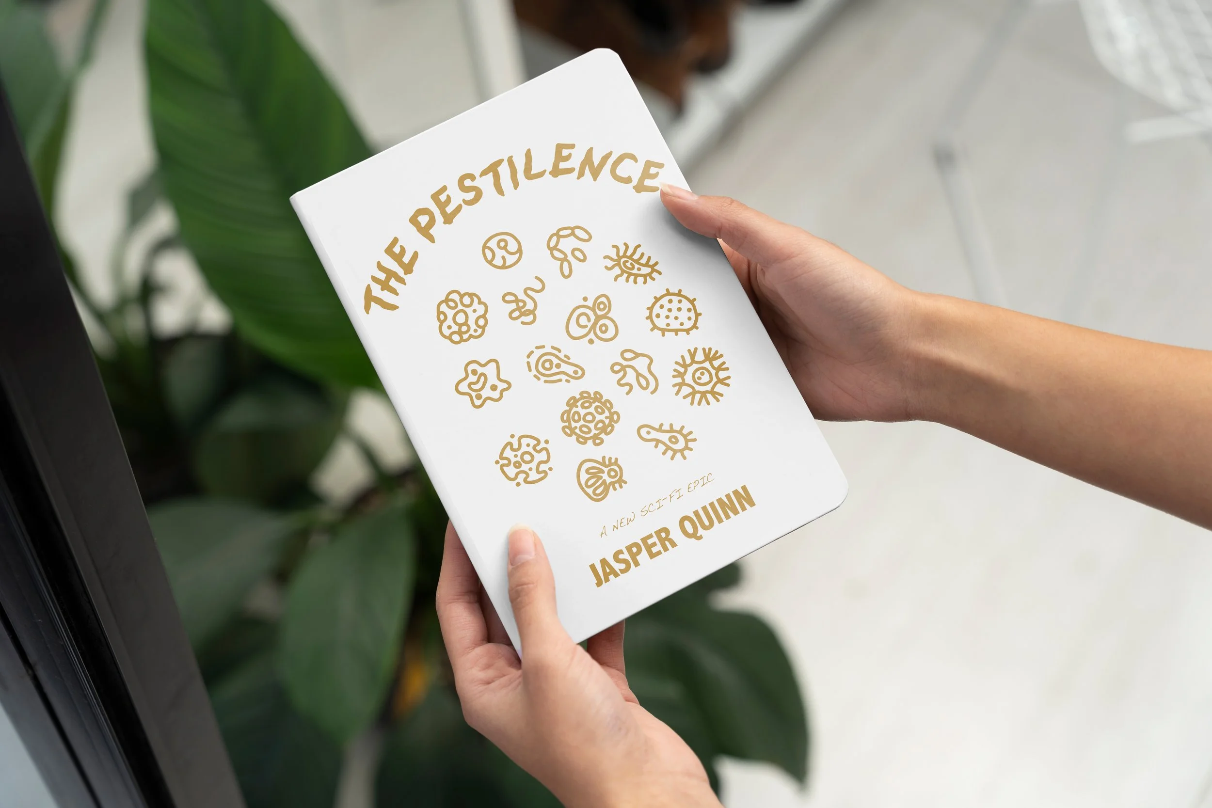
The Pestilence is a final class project created for a Typography course at SNHU. The goal was to create a full spread book cover that showcased effective typographic techniques, and met print standards. The Pestilence is an original book title and the genre of book, is science fiction/sci-fi. There are two versions of the book cover design, one regular edition (pictured right) and the classic edition cover showcased below. The intended audience of The Pestilence is 21-35 year old men and women that have an interest in science fiction pop culture such as sci-fi movies, art and novels. The concept for The Pestilence involves a team of scientists in the near future who have discovered the cure for cancer. After the scientists have successfully tested and implemented the cure to parts of the population, the cure has mutated into a virus that is capable of causing extinction of human life on earth. The team of scientists are left with trying to reverse the virus and are faced with the uncertainty that they may be too late.
Thought Process & Concept Sketches
More than the theme of the book, my aim was to showcase strong and effective use of design principles such as balance, hierarchy, and alignment within the design. A key element I wanted to showcase in the book’s design was imagery of bacteria/germs and spores, since the books revolves around a virus. I also wanted to showcase my imagination and creativity with this concept and went over various ideas and iterations of how I wanted to present the project. I sketched out different layouts that would compliment these bacteria references in a visually appealing, yet functional way that focused on showcasing strong use of fundamental design principles.


Color Palette & Typography
Selecting a typeface that suited the feeling and genre of each iteration of the book cover was tricky. I wanted to use a typeface that resembled the theme of the book and through some experimentation I settled on a two main typefaces that suits each book covers feeling and mood. Another challenge was in the arrangement of elements such as the text, titles and body copy within the layouts because I wanted the finished design to showcase strong typographic techniques and formatting, since the project was created for a typography course.
Outcome
The outcome resulted in two polished book cover designs, each with a certain feeling and mood which also both showcase strong utilization of design principles and typographic formatting and techniques. The original book cover (full art cover version) and the classic edition cover (white version) were created to exemplify the importance of creating multiple edits and versions of a project.